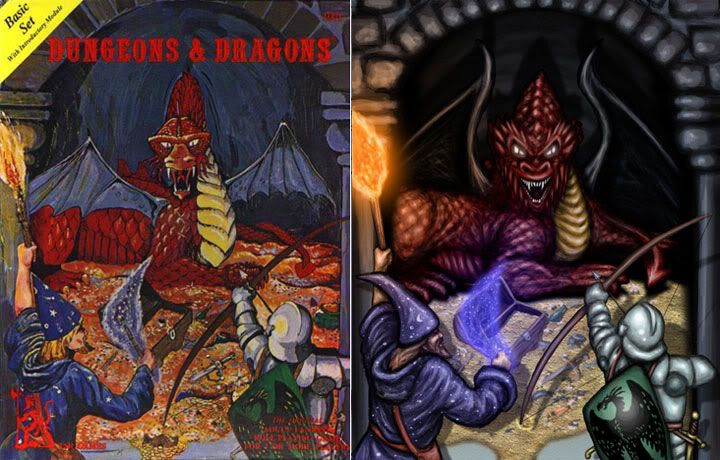
So speaking of paint job, I'm trying to figure out how to paint the damn thing. My mind wanders back to 1979 when I first got involved in D&D. My intros to Red Dragons looked a little something like this:


(Holmes box picture from http://xeveninti.blogspot.com/ )
Yea, I like that, iconic, old school, always how I picture.. WAIT!!! What is up with those damn wings!?!
The grey wings are a theme that has popped up before, with the cockatrices - they had leathery grey wings according to ye-olde AD&D Monster Manual. A check of the AD&D book, and going back to OD&D Monsters & Treasures doesn't help - colors were not really described. That's not a problem, per se, but I'm still at a loss what the deal is with the grey wings. There's something I'm not liking about this deal.
(Anyone know why the fascination with the grey leathery wings theme?)
Then I saw this by an artist known as Kevin Mayle. (From here... http://odd74.proboards.com/index.cgi?action=display&board=workshop&thread=969&page=1#22807 and he was still doing posts in 2010... very nice work.)
I like the way he has the wings - a more developed black/grey theme that hews to the original and yet has a much nicer look than the dull grey from the covers. Now we're cookin here! Thanks for the inspiration Kevin.
So the dilemma is this... stick to the simple or go off the ranch? I'm not looking to go much beyond this scheme, but I'm going to be digging to see how I can enrich the red/orange/yellows here to make them more evocative. Interestingly, the picture I used in my post last year has a lot of influence from the same old covers - that artist and I have the same idea.
Wish me luck on this one...


No comments:
Post a Comment