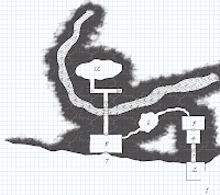
One of the things Sham and I differ in is the "how" we're doing the dungeon maps themselves. Sham prints out his grid, draws his maps (I'm not sure if that's pencil, or ink, but his maps are wonderful), scans them in and places the scanned map into the template.
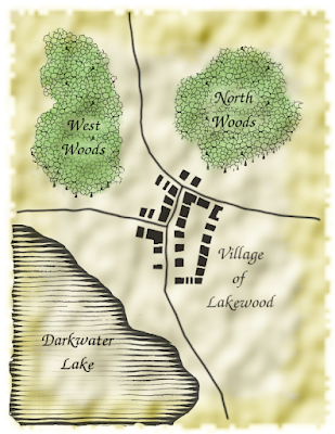
 I've been drawing my maps using GIMP (open source Photoshop) and my trusty old school serial Wacom tablet. I started doing this last year. Alot of this is thanks to the ZombieNirvana set of RPG mapping videos and the fine RPG mappers at Cartographer's Forum.
Now I've been working on my 1E/OSRIC campaign materials, so I can't unfortunately share them yet (sidenote: Do you hold your stuff in reserve until it's been played?) but I did want to share the things I've been doing in GIMP and the resources I've used to create my dungeon maps in GIMP.
 I was inspired by these three forum threads and highly recommend them as starting points:
How to create simple dungeon plans (thread has specific GIMP instructions, see post #12)
RobA's Using GIMP to create artistic regional maps
Creating an old school map in GIMP
These, as well as the aforementioned ZombieNirvana videos have really helped me to learn alot about mapping and using a program like GIMP. Although the ZN techniques are done in Photoshop, you can easily translate to GIMP (or see my posts on Cartographer's Forum where I fumbled my way through...)
To use the One Page Dungeon Key with GIMP, I do the following:
1. Draw my map in GIMP, using this template of the 30x30 squares grid map. This GIMP native file (XCF) is set to 5"x5", 300dpi, the grid is roughly 6 squares/inch (about the same as what we use on regular graph paper).
2. "Compress" the map by setting the colors to indexed. Menus: Image > Mode > Indexed - select/leave it on the "Generate Optimum Palette" option. This reduces the number of colors your image will "save", making your file smaller.
3. Export it as a PNG. Import the PNG into the One Page Key template in Open Office (or Word) and move it to fit the space for the grid. (You will need to remove the existing blank grid if it's still there.)
4. Key and go!
----
One of my goals in 2009 is to become a better artist. To that end, doing these maps is really motivating me to learn more drawing techniques. Using a tablet is hard, but I've been practicing and I've picked up some really cheap drawing supplies to learn it on paper. As well, I've picked up simple kids "how to draw" books. This sounds funny, but I have such a mental roadblock to drawing - I believe that I suck! Having these kids books is a safe way for me to feel like I can do it. The one I picked up yesterday is Draw 50 Monsters - there's a whole series of these wonderful books and I'm going to get a few more.

5 comments:
You bet I hold stuff in reserve until after it's been played. But not everything. If there are 5 new monsters in an adventure, I might post one now and hold the other 4. Same with items, etc.
I have an online and a tabletop game both set in the same world (1 group is actually hunting the other one.) and they read the blog every day.
Ahh, I see you own a Wacom tablet. That explains how you're able to get such clean images when doing a map straight into a graphics app. All I have is my mouse, so I prefer to do it all by hand.
As for keeping things in reserve, that's one of the reason I've embraced the One (or in my case, Two) Page Dungeon Method. Ol' Nameless has been my massive baby that I've not wanted to make public, keeping it in reserve for actual play, but by posting One Page excerpts from the new OD&D/Holmes/Moldvay/Labyrinth Lord megadungeon, I can share some of my design thoughts, tricks of the trade, and such, without spoiling the surprise of Ol' Nameless. It's a nice compromise for me and for the blog.
No, by all means, make it public. As one of the players in Chgowiz's 1e/OSRIC game, I'm eager for a look at what my sad little thief will be up against.
@Virianta - Thanks, much appreciated.
@Mike - Well, most of the straight walls were done with the "Click/Shift/Click" technique that creates a straight line. I am still learning to freehand on the tablet.
@Patrick - Funny! ;)
Thanks for linking those articles, Chgowiz. I've been trying to work out how to make a decent looking map in either Photoshop or Adobe Illustrator, but have so far not been so happy with the results.
For running online games that require a semi-interactive combat map, I have developed an HTML/Javascript web page code that shows a map and movable player/monster tokens. It don't run in Firefox, but still can come in handy. Maybe soon in Garish's online game you'll get a look at it and get to see firsthand whether those articles help improve the looks of my cheesy maps.
Post a Comment